Desktop Management Application for XM Radio's Mobile Device
Summary (TL;DR)
By using User Experience Design Principles and persistence, I transformed a project from a collection of mismatched features into a focused application that avoids confusion and does just what it says.
Introduction
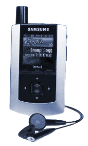
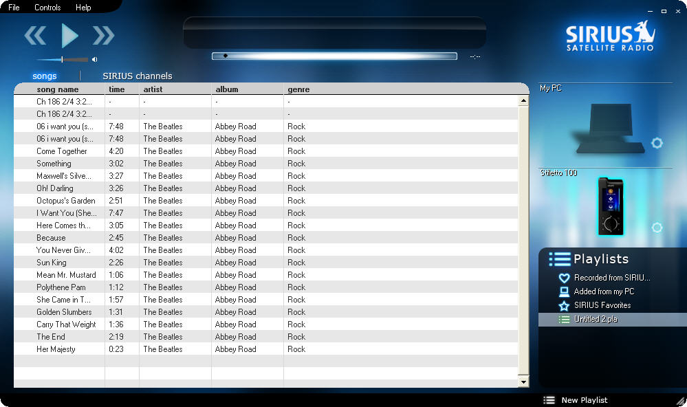
On the second day of my new job at razorfish, I was assigned to lead User Experience (UX) Design for a desktop application which would interface with XM radio's suite of mobile devices. The project was referred to as the XMDMA or XM Device Management Application.
The project manager introduced it as:
"The XMDMA is like iTunes for XM".
Learning The Landscape
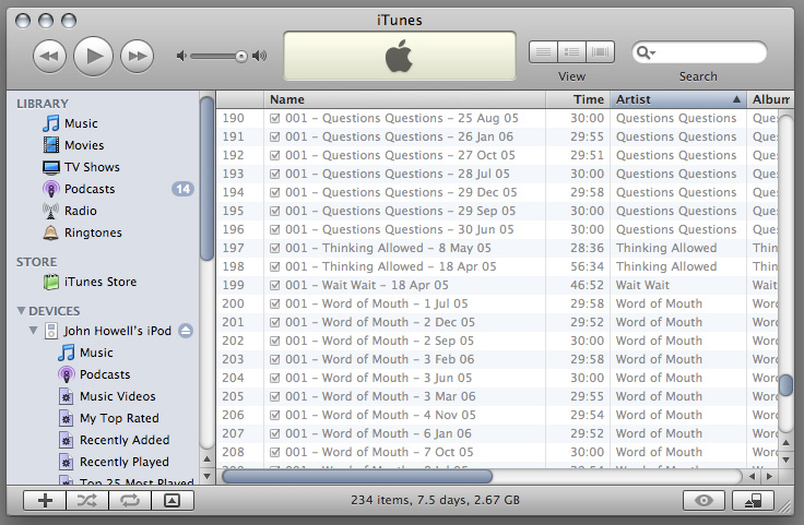
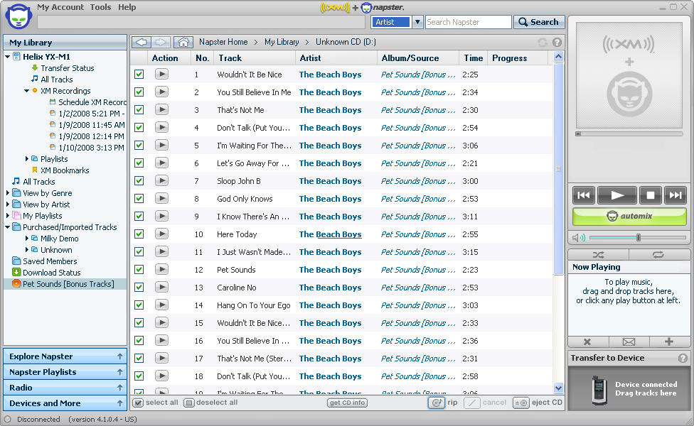
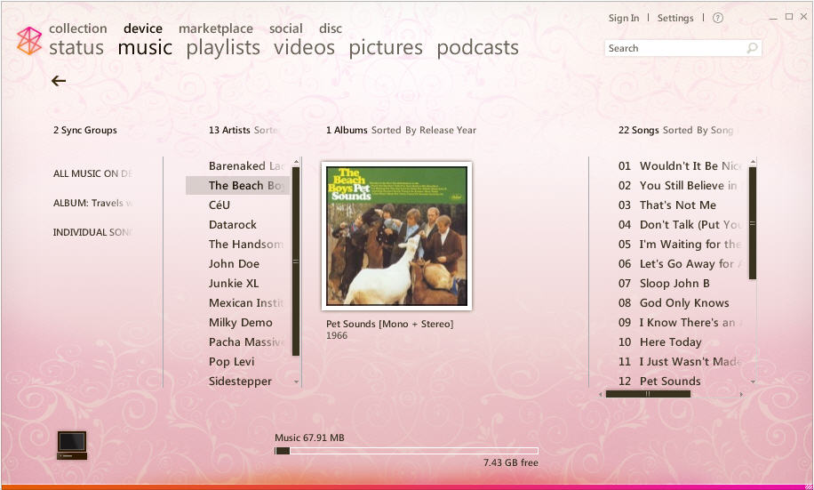
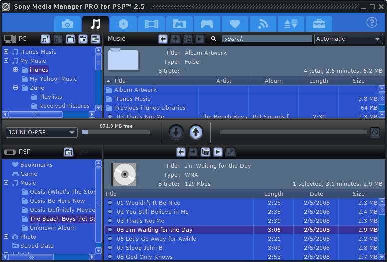
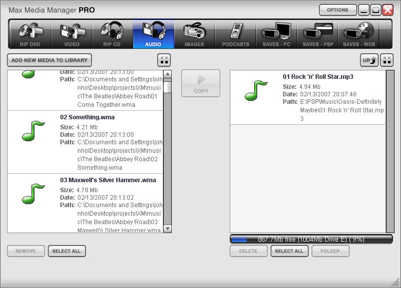
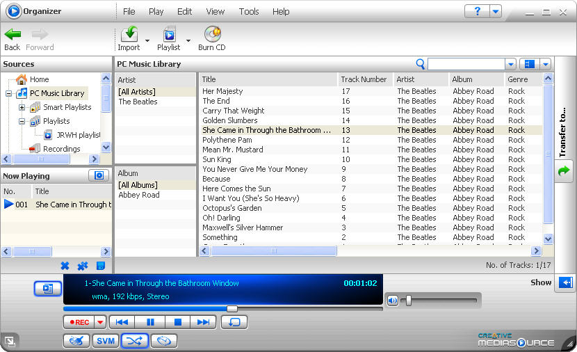
At the time, I was only familiar with iTunes as a desktop management device. As a first step I obtained a number of other devices and their corresponding applications to become fluent with this type of hardware to software relationship.
Internalizing What I Learned
While auditing the applications above, I began sketching out various potential layouts based on them and my own ideas.

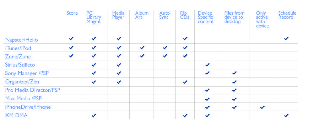
In order to share my findings with the team, I put together a number of documents such as this features matrix and a general write up (download the bare bones doc here)
I created a presentation to give to my team that included this chart:
Talking Tech
Now that I had a more intimate understanding of how media managers work, I was ready to start talking to the engineers to find out how our application functioned. What uniques features could we include? What limitations were we saddled with?
There were a number of limitations built in to the project from the outset. Most could be improved or solved through design, but one threatened the success of the project.
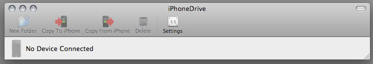
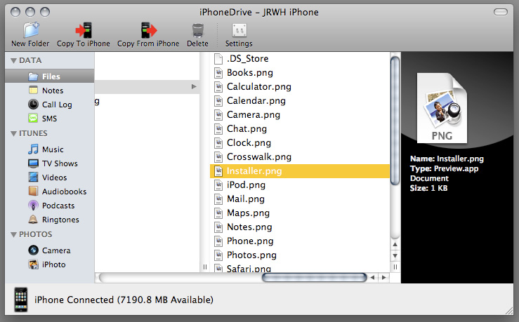
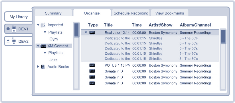
The application would NOT have the main features of a desktop music manager. Most importantly, there would be a list of all the media on the computer but no way to play them.
This was a problem because the application described in the Statement of Work (known as the S.O.W.) and what everyone on the team was seeing in their head was something structurally resembling something akin to iTunes or one of the handful of other music management applications.
The Revelation
An interface that implies functionality but does not deliver it is a bad experience. If we continued down the current road, we would be making a bad iTunes for XM. However, with some course correction we could help users manage their devices without having them make comparisons between our simple application and iTunes' robust feature set.
My Mission
Remember, I was the newest member of this team and had only been with the company for a few days. I had not yet built a reputation with my coworkers, yet I would be asking them to change direction on a project they had been planning for months.
I needed some compelling arguments:
Borrowing from Google's philosophy of "It’s best to do one thing really, really well.". My version became: Offer an interface that does what it does well and leave out any half measures.
An interface which implies functionality that it does not deliver will be a disappointing experience.
Or more specifically:
Delivering something that looks like a music management application without the expected features will be perceived as a bad music management application.
In any campaign, it is nice to have a catchy slogan so I started using
"The Device Management Application is an Application that Manages the Device...Period"
With these arguments in hand I set out to change the trajectory of the project.
One by one, I went to every member of the team and laid out my reasoning for wanting this change. Nearly everyone pushed back and had some reason why we should keep moving forward as expected. I listened to all their points and took them all in to consideration. As we discussed their concerns and played out the different scenarios, I remained convinced that my recommendation was valid.
While some people were easier to convince than others, everyone eventually came to agree that the project needed to change.
Success!
After getting the team on board with my proposal, we were able to present the idea to XM in unity. Having fielded all the concerns from the various members of my team it was easier to anticipate the client's concerns and address them with well thought out responses.
XM ultimately agreed on the change of direction and switched their thinking of the application as "iTunes for XM" to something more like a desktop interface in to the XM portable device, more like a fancy FTP program that does only a few things but does them well.
In Conclusion
Design is about making decisions - and sometimes the most important decisions are what to omit.